Hello, this is Inaba.
This time, as the designer of GR III, I would like to talk about something maniac regarding the grip again! I wrote an article about the grip shortly after the GR III was released. I am surprised it's been two years!
* Click here for the previous article
First, let's compare the bodies of GR DIGITAL IV and GR III.
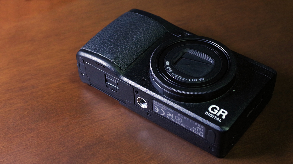
GR DIGITAL IV
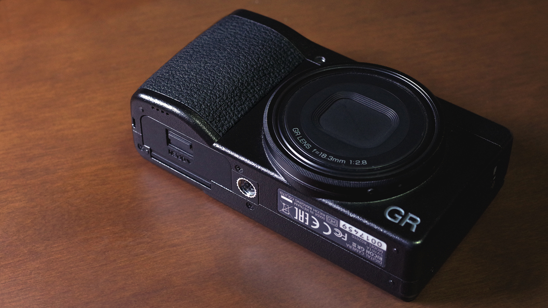
GR III
At a glance, they look similar, but can you see the difference?
The GR DIGITAL IV was designed in a way that the ridgeline of the body is scraped. It is called "C Surface" or "Chamfer", and it provides more direct finger contact. This design process continued until the GR and GR II.
* "C" of the C Surface stands for "Chamfer".
How about the GR III? It's a little different. The ridgeline of GR III is rounded. This is called "R Corner" or "R Ridgeline", and it provides softer finger contact.
* The "R" on the R Ridgeline stands for "Radius".
As you can see from the comparison photo below, the design approaches are very different even for the same GR series.
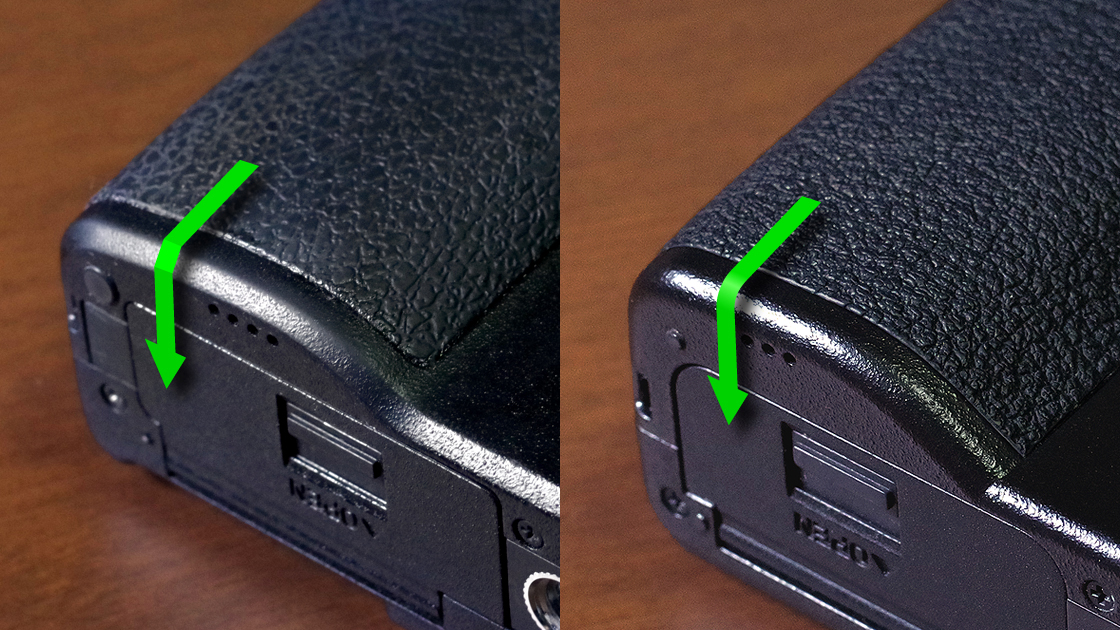
Left: GR DIGITAL IV with ridgeline on C Surface / Right: GR III with R Corner ridgeline
This difference in the design process comes from the difference in thinking, particularly regarding how to grip. So why did we change the design process of GR III to "R Corner"?
The good thing about the "C Surface" is that your fingers fit well by matching them to the angle of the shaved surface. On the other hand, since it determines the holding angle of fingers, the angle of the finger that touches the "C Surface" determines the position of the other fingers. Therefore, a body shape with a certain amount of grip space is necessary. From the GR DIGITAL IV to GR and GR II, they have relatively enough grip space to comfortably hold the camera.
However, with the downsized GR III, since the space between the protruding part of the lens and the grip is narrow, you have to optimize the finger position for yourself within that narrow space. Therefore, the angle of the finger that touches the ridgeline at the bottom of the grip varies from person to person.
We have applied the "R Corner" design in order to minimize the difference in grip feel when the finger touches it with various angles.
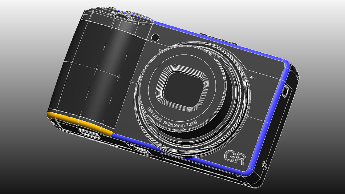
GR III 3D modeling data
The image above is the 3D data of GR III (first appearance?) The designers themselves create these kinds of models. It's quite difficult! The ridgelines are colored for your easier understanding.
The "R Corner" treatment of the ridge does not make a difference in comfortability of holding regardless of the angle of the finger(s), but the touching finger can hurt if the roundness is small.
Therefore, I did another special design to the GR III's "R Corner".
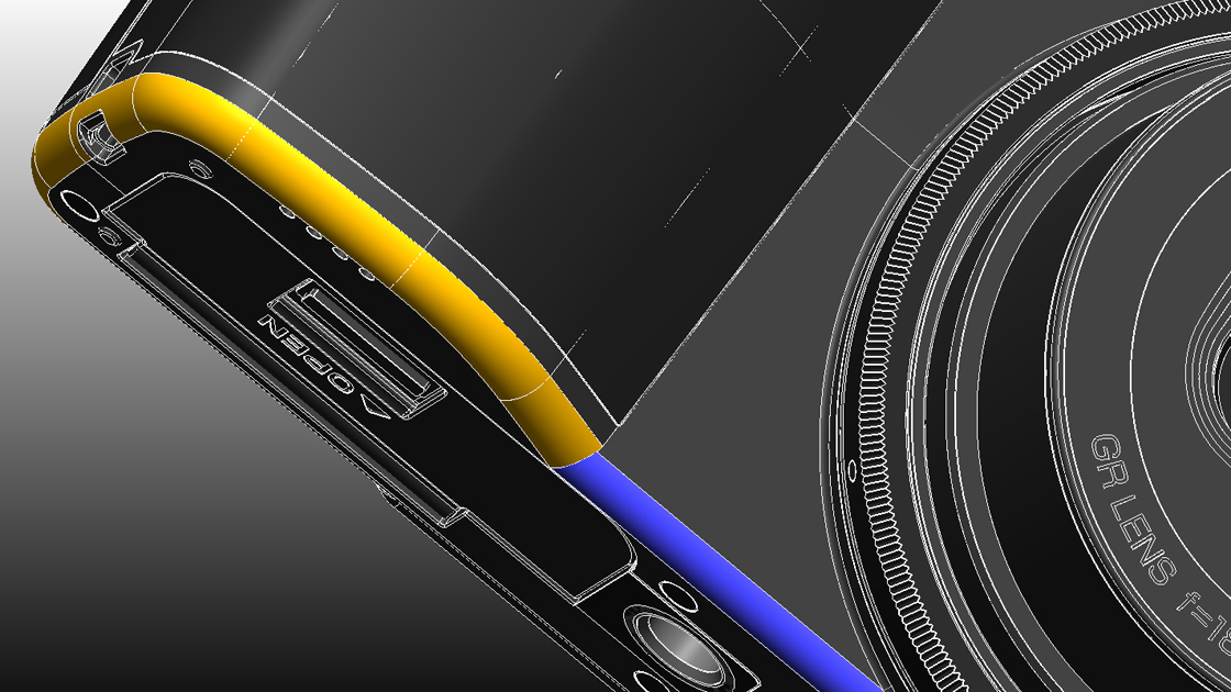
Ridgeline at the bottom of the grip (yellow part)
Actually, the roundness of the ridgeline under the grip (yellow part) is larger than the ridgeline of the body (blue part) in order to make the finger contact even softer. From a product design perspective, it looks better to make all the corners with no gaps, but based on the idea of "GR = tool", the roundness of the ridgeline should be made as large as possible so that the fingers do not hurt when holding.
Gaps in the ridgeline would make the product look odd. That's where the designer can show his skills.
If you have a GR III, please touch it for yourself to see the design.
That's it for my story that the designer tries and errors even small details in order for everybody to use GR as the ultimate snap shooter (too hard to understand?)
Lastly, I've seen amazingly colored sunsets several times recently and taken a lot of pictures.

GR III Av mode F6.3 SS1/6 ISO100 EV-2.7 CTE with in-camera correction after shooting
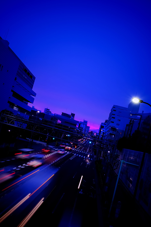
GR III Tv mode F7.1 SS0.5 ISO100 EV-1.0 CTE with in-camera correction after shooting
I have made bold adjustments to JPEG image quality, white balance, and level correction in the camera, which explains that you can adjust JPEG photos very much in the camera (laughs).
See you again!
(Inaba)


